Swiss Web Design — a case study
Swiss web design is more than just an aesthetic choice; it’s a purposeful approach to delivering clean, intuitive, and effective digital experiences. This design philosophy, rooted in Swiss culture, is based on three fundamental principles: clear layouts, clutter-free navigation, and an emphasis on efficiency. These characteristics are the foundation of many successful websites today, allowing them to provide seamless and interesting user experiences.

What Makes Swiss Web Design Stand Out?
At its core, Swiss web design is straightforward, minimalistic, and occasionally abstract. However, its efficacy is obvious. Global brands and successful businesses frequently include essential components of Swiss design to make their websites more practical and user-friendly.
Let’s break down the three key principles that define Swiss design:
1. Simple layout: Swiss designers are renowned for their precise use of grids. This structure facilitates the organization of content in a visually appealing and user-friendly manner. Swiss web design uses a grid approach to ensure that any complex material stays clean, orderly, and digestible.
2. Clutter-free Navigation: Swiss web design emphasizes efficiency. It eliminates extraneous items and focuses only on providing a straightforward user experience. Navigation menus are clear, simple, and created with the user’s needs in mind. There are no distractions or confusion — only a direct path to what you need.
3. The Swiss Efficiency Factor: Switzerland is noted for its precision, efficiency, and practicality. These characteristics are represented in Swiss website design. It represents a simple, straightforward approach that gets the job done while keeping a sleek and professional appearance. Whether it’s a public transportation system or a computer interface, the Swiss approach prioritizes minimizing friction.
The simplicity of Swiss design delivers numerous major benefits, particularly when applied to websites:
- Improved User Experience: The structured layouts and clear navigation create a more seamless user journey, reducing annoyance and misunderstanding.
- Enhanced Readability: Swiss design is based on typography, so text is simple to read and assimilate. Clear typefaces and well-spaced layouts make it easy for the reader to navigate the website.
- Time Efficiency: Because everything is laid out simply and efficiently, users spend less time looking for information, allowing them to focus on what is important.
- Versatility: The ideas of Swiss design may be applied to a variety of mediums, including business websites, mobile apps, and printed marketing materials.
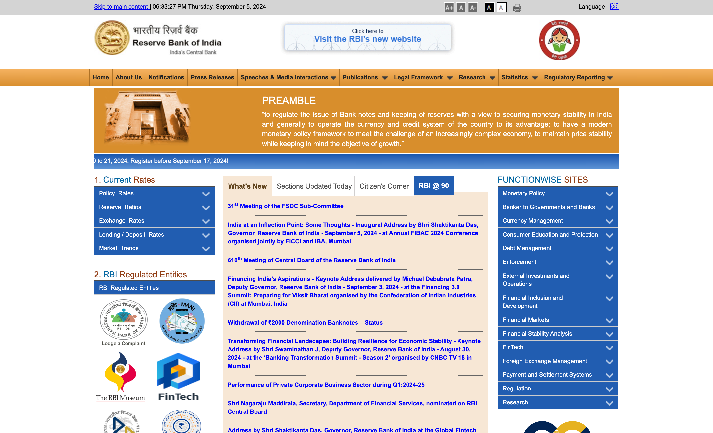
To demonstrate the impact of Swiss design principles, consider the website designs of the Reserve Bank of India (RBI) and the Swiss National Bank (SNB).


- Website Design: The RBI website has improved significantly over time. However, it remains relatively congested with multiple links and banners, which can be overwhelming for visitors. In contrast, the Swiss National Bank website exemplifies the Swiss design aesthetic — clean, simple, and well-organized. The use of whitespace and simple navigation conveys calm and professionalism, making the user experience more intuitive.
- Contents: The RBI website has a plethora of information, spanning from monetary policy to banking laws. However, much of the content is technical, which might be difficult for non-experts to understand. The SNB maintains a mix between detailed financial information and more accessible content. The site’s articles and publications target both professionals and popular audiences, making it a more inclusive resource.
- Transparency: The RBI has increased transparency by publishing thorough reports and data. However, the site’s layout may make it difficult to locate this information fast. Swiss efficiency is seen in the SNB’s transparency. Key documents, studies, and data are easily available, making it a useful resource for anybody interested in Swiss monetary policy.
- Accessibility: The RBI website provides useful information, but its accessibility features are restricted. Users with impairments may struggle to browse the site because features like alternative language for images and keyboard navigation are not completely integrated. In contrast, the SNB website takes accessibility very seriously. The website includes features such as alternative text, keyboard navigation, and high contrast options to guarantee that all users, regardless of ability, can interact with the information.
The comparison between the RBI and the SNB demonstrates how applying Swiss design principles can result in a more efficient, user-centric experience.
Some takeaways for RBI’s Website

The RBI’s website has made significant improvement in recent years, but there are still crucial areas where a simple, Swiss-inspired approach may improve the user experience:
- Reduced Clutter: By simplifying the layout and removing unnecessary features, users can focus on important information without distraction.
- Streamlined Navigation: Clear, straightforward menus would allow consumers to discover what they need more quickly, minimizing the amount of time spent seeking for information.
- Increased Use of Whitespace: By adding more whitespace, the RBI website could appear cleaner and more professional, making it simpler for readers to comprehend the content.
Conclusion
Swiss web design takes a timeless approach, emphasizing practicality, clarity, and speed. By adhering to these principles, designers can build visually appealing and highly effective digital experiences. Whether you’re creating a corporate website or a personal blog, Swiss design principles provide a solid foundation for achieving clean, user-friendly, and visually appealing results.
